REMINDER OF IMPORTANT STATISTICAL CONCEPTS
https://www.bmj.com/about-bmj/resources-readers/publications/statistics-square-one
A great set of tools by Nature
Biostatistics or biometrics is one of the single most important courses one can take – and is a foundation of much of bioinformatics. In this section, we provide a review of some of the major concepts as a refresher – or to insure that you have some introduction to some major concepts.
Resources
- Introduction to R by Thomas Girke.(https://girke.bioinformatics.ucr.edu/manuals/mydoc/mydoc_Rbasics_1.html)
- R & Bioconductor Manual by Thomas Girke UC Riverside (http://manuals.bioinformatics.ucr.edu/home/R_BioCondManual)
- Little Book of R for Bioinformatics (https://a-little-book-of-r-for-bioinformatics.readthedocs.io/). Free excellent book for pure R.
- Top 50 ggplot2 Visualizations. (http://r-statistics.co/Top50-Ggplot2-Visualizations-MasterList-R-Code.html)
- Lynda.com. Free for USC faculty , staff and students.
- Learning R (2hr 51min)
- R statistics (5h 59m)
- R for Data Sience (7h 16m)
- Data Wranging in R (4 h 12 m
- Data Visualization in R with ggplot2 (2hr 27)
Data Wrangling: dplyr and tidyr
A foundation for wrangling in R including aggregation and joining functions:
Datasets
For this set of examples, we will have folks download a tar.gz which is a frequent way data is concatenated and compressed.
Please get a tar.gz from the following repository:
https://github.com/davcraig75/510dataset1.git
This yields the files below. Please place them in a directory called trgn510.
expression_results.csv
kg.genotypes.csv
kg.poplist.csv
sample_info.csv
trgn599.clinical.tsv
trgn599.rna.tsv
Descriptive Statistics
We will use R to explore a dataset:
Lung Cancer Clinical Data
Clinical statistics for a cohort of individuals with Lung Cancer: trgn510/trgn599.clinical.tsv
Load Data In:
clinical_info <- read.csv('trgn510/trgn599.clinical.tsv', header=TRUE, sep="\t")
We can view the table as a dataframe:

We’d like to learn more about this data:
summary(clinical_info)

One concept most are familiar with is mean, mode, and median. Lets think about a few that describe the variation of data across a cohort.
Simple stats
Lets take the mean of a column, noting we access the column through $. Also note that we need to specify about navalues and explicitly declare whether or not to consider them.
mean(clinical_info$height, na.rm = TRUE)
Factors
Lets reload our data in, but this time we want to categorize and creates factors.
Load Data In:
clinical_info <- read.csv('trgn510/trgn599.clinical.tsv', header=TRUE, sep="\t",stringsAsFactors=TRUE)
summary(clinical_info)

We can see that we have categorical data now. We can summarize for example:
aggregate(clinical_info$cigarettes_per_day,by = list(race = clinical_info$race,ethnicity=clinical_info$ethnicity), na.rm=TRUE,mean)

Using tidyr
There is a library which allows for a lot of data wrangling, called tidyr,dplyr. These include verbs such as filter,group_by, and summarise. We introduce the concept of pipes: %>% to link these together
library(tidyr)
library(dplyr)
clinical_info %>%
filter(Sample.Type == "Primary Tumor") %>%
group_by(race) %>%
summarise(mean(cigarettes_per_day,na.rm=TRUE))

Using ggplot2
ggplot2 is another source of functions associated with graphing
library(ggplot2)
p <- ggplot(clinical_info, aes(y=primary_diagnosis, x=cigarettes_per_day)) +
geom_boxplot()
p

Scatter
ggplot(clinical_info, aes(x=cigarettes_per_day, y=age_at_diagnosis, color=ethnicity, shape=ethnicity)) + geom_point() + geom_smooth(method=lm)
ggplot(clinical_info, aes(x=cigarettes_per_day, y=age_at_diagnosis, color=ethnicity, shape=ethnicity)) + geom_point() + geom_smooth(method=lm, se=FALSE, fullrange=TRUE)

Distribution of our dataset
ggplot(clinical_info, aes(x=cigarettes_per_day, fill=gender, color=gender)) +
geom_histogram(position="identity")

Variance / Standard Deviation
Variance is the expectation of the squared deviation of a random variable from its mean. Variance is the expectation of the squared deviation of a random variable from its mean.

Probability
Probability is the likelihood of something occurring. If I role a 6-sided dice, I have a 1 in 6 chance of getting a 1. If I flip a two-side coin, I have a 50% chance of a head. If I flip a 2 sided coin 50 times, what is the probability that I get 75 or more heads? We often write probability as:
p(X=4)=16.6%
that is the probability of getting a 4 is 16.6%
Probability Distributions
A joint probability distribution is a description of all the possibilities and the probability that they will occur. If I role a six sided dice, I have an equal probability (16.6%) of getting a 1, as is the case for a 2,3,4,5,6. Its often characterized by a Probability Mass Function (PMF) which provides the probability of each event. If I role a six sided dice, what is the probability that I get a 7?
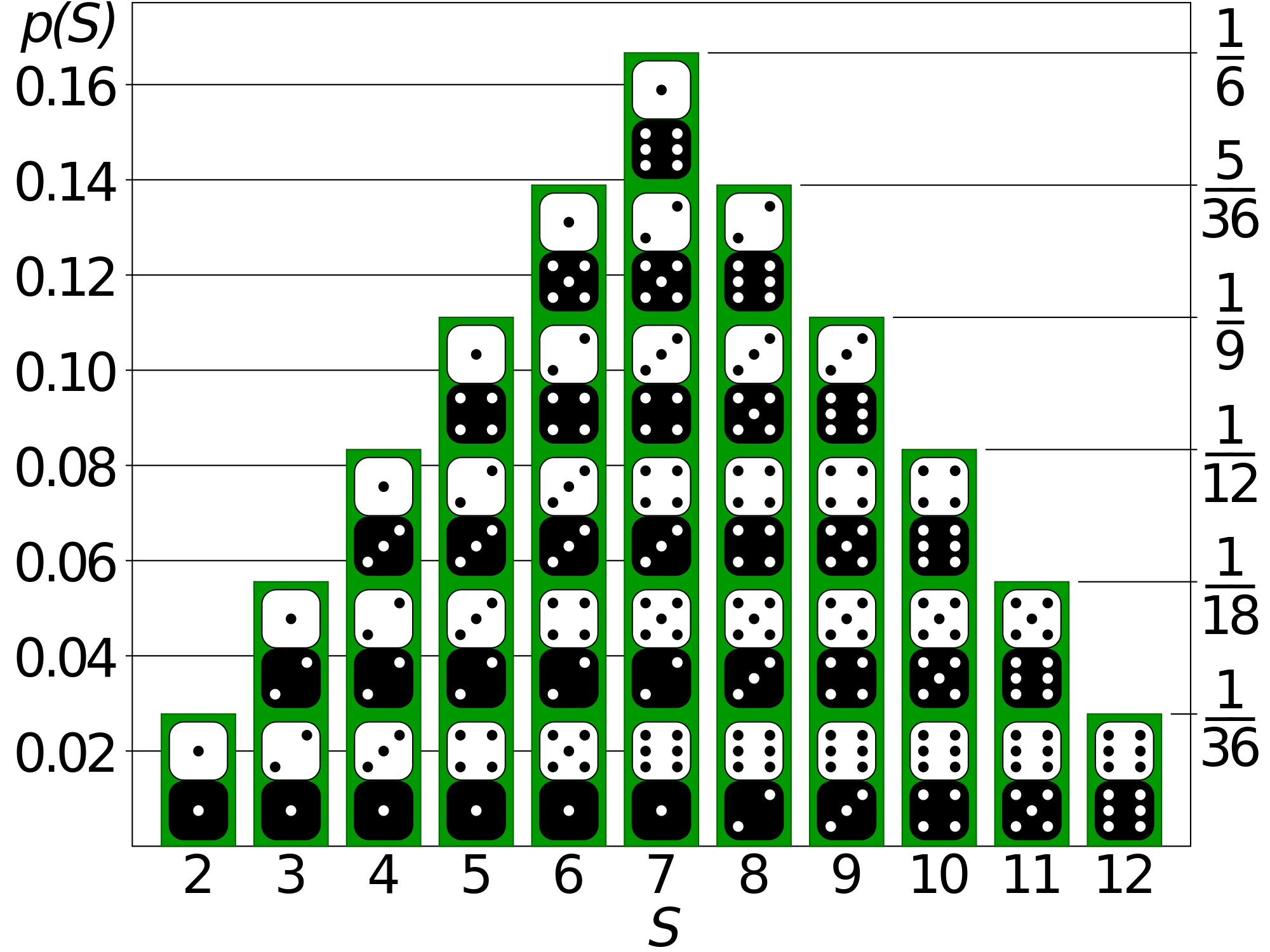
Another key term is the Cumulative Probability Function (CMF), which is the sum that event or lower will have occurred.

There are a few probability distributions we care a lot about in bioinformatics. The normal distribution (or Gaussian) and binomial distribution (binary events, such as a coin toss). Normal distributions are common in biology – but cannot always be presumed. A normal distribution is famously represented as a bell curve.
Correlation
Correlation is any statistical association, though in common usage it most often refers to how close two variables are to having a linear relationship with each other.
Correlation is often described as correlation coefficient – which can be calculated in different ways depending on whether one believes the underlying data is a normally distributed or not. When normally distributed, we calculate the Pearson correlation efficient. When this is not the case, one can calculate the Spearman which avoids the tail wagging the dog.
We have our two datasets: expression_results.csv.gz and sample_info.csv.gz, which likely we have decompressed by unzipping to expression_results.csv and sample_info.csv within the directory RNASeqExample.
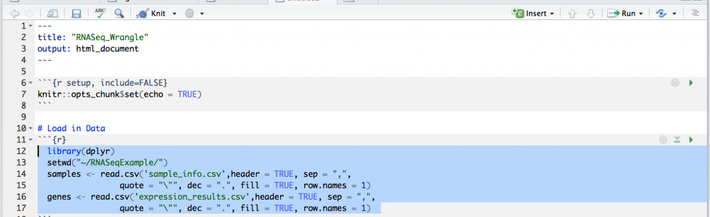
Lets open up R Studio and lets create a new markdown called “RNASeq_Wrangle.Rmd”. Lets make sure we don’t have the demo code in there and elete everything from “R Markdown” down online 10, such that it reads:
---
title: "RNASeq_Wrangle"
output: html_document
---
```{r setup, include=FALSE}
knitr::opts_chunk$set(echo = TRUE)
Now lets start by loading in our libraries (if dplyr’s package isn’t installed you should type install.package(“dplyr”) in the command line window. Lets first create an “R” codeblock by clicking “Insert” and then selecting “R” from the pull down. This is directly above next to the green “+c”. Lets load in the files into two dataframes: samples & genes. The following should be in your code block.
The following may have an issue for you where you need to add a backslash before the quote.
 library(dplyr)
 setwd("~/trgn510/")
 samples <- read.csv('sample_info.csv',header = TRUE, sep = ",", dec = ".", fill = TRUE, row.names = 1)
 genes <- read.csv('expression_results.csv',header = TRUE, sep = ",", dec = ".", fill = TRUE, row.names = 1)
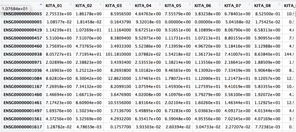
Press the green arrow in the upper right side to run the code block. There may be a few notes involving dplyr. You should see in the upper right there are two dataframes for samples and genes. We can click on each to get a preview. For examples, the samples dataframe is shown below.
samples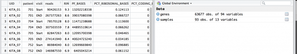
genes
One thing we notice is that the UID, or unique ID is a column name for genes, and within the first rows of samples. UID’s are important concept and they are guaranteed unique row within a table, study, or in fact globally… or universally (UUID).
Lots understand the data we are looking at a little better, and graph genes for two different samples by putting:
plot(genes$KITA_01,genes$KITA_02)
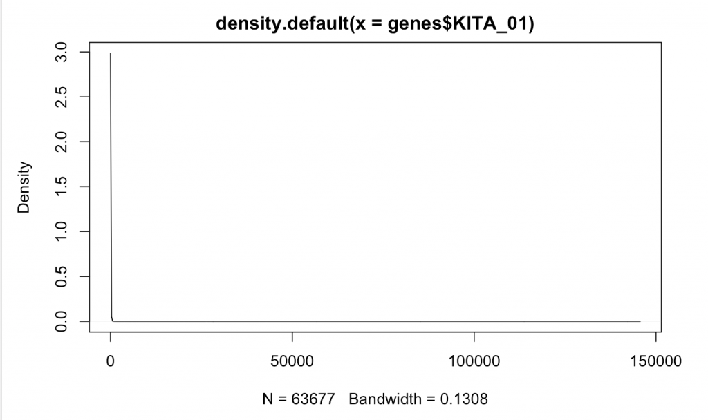
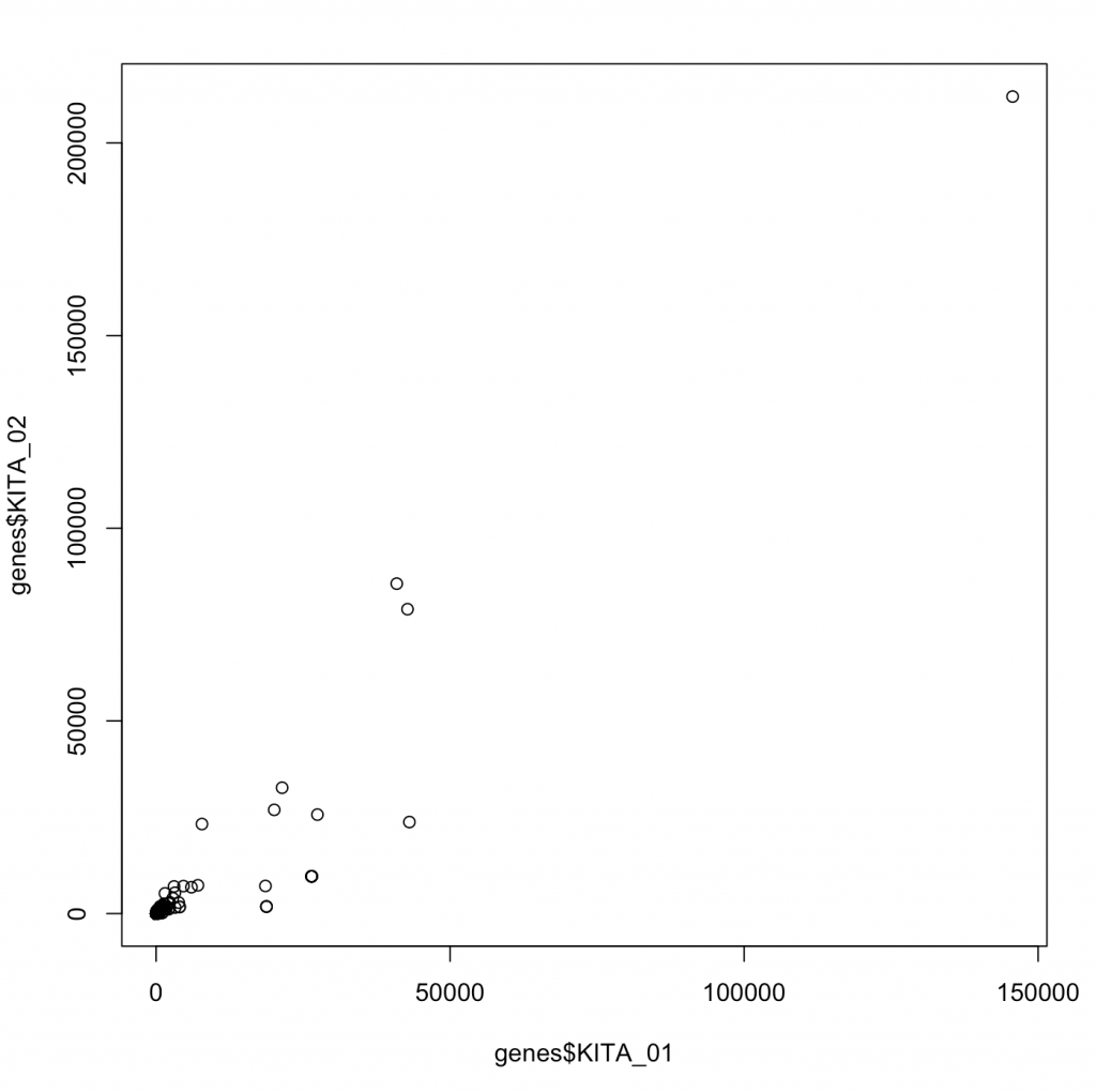 While we graphed 63,677 different points for these two genes, you wouldn’t know it as most of these have really very low values. Moreover, the data look correlated driven by large 4 points. This is an instance of what is likely non-parametric data (or data that doesn’t fit a normal distribution. We can make a distribution of where the data are:
d <- density(genes$KITA_01) # returns the density data
 plot(d) # plots the results
Compare that to something more likely to be random normally distributed such as RIN for our samples:
d <- density(samples$RIN) # returns the density data
 > plot(d) # plots the results
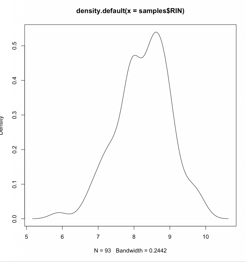
Clearly we aren’t normally distributed. Generally its wise to follow central-limit theorem when looking at data – or presume it to be non-parametric (Spearman), instead of parametric (Pearson). What we are doing is same as graphing on a log plot –
plot(density(log2(genes$KITA_01[(genes$KITA_01>0)])))
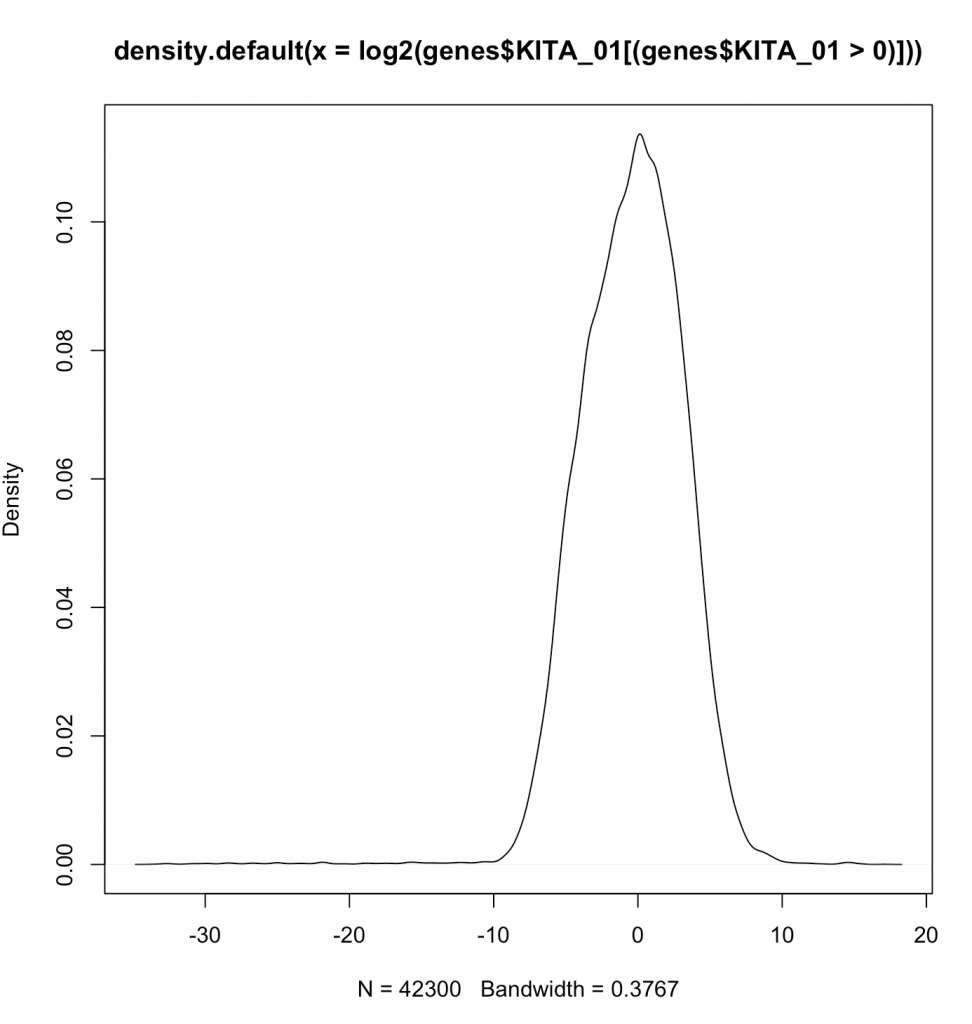
Aren’t log’s fairly magical at making things normal? Note that we are not showing the zeroes by the filtering done in line (genes$KITA_01>0). Now lets actually plot the log2 values.
plot(log2(genes$KITA_01[(genes$KITA_01>0 |genes$KITA_02>0 )]),log2(genes$KITA_02[(genes$KITA_01>0 |genes$KITA_02>0 )]))
Now we see a plot showing us how two random different genes correlate. If we wanted, we could calculate a Spearman correlation or a Pearson correlation. A Pearson correlates the values, and the Spearman correlates the rank. Generally, Spearman is robust to the values and does not suffer from “tale wagging the dog”. Calculating the Pearson correlation coeffecient (r2) tell us about the percentage of variance given the other.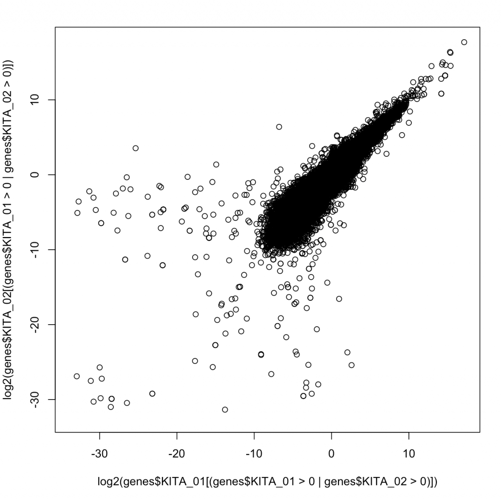
Ok – so in this case say that we wanted to create a dynamic range – how many orders of magnitude between the greatest and smallest value for each sample and then stores those in a new dataframe.
Lets use dplyr to make a new dataframe with some summary information.
samples$uid=rownames(samples)
genes_summary<-data.frame(
 UID=rownames(samples),
 min=minBySample <- sapply(genes, function(x) min(x[x > 0])),
 max=maxBySample <- sapply(genes, function(x) max(x))
 )
We introduce some major statistical ideas and present them with the knowledge that the best statistical tool should always be based on working with experts in biostatistics or following examples laid out in analogous high impact articles. In applied bioinformatics we are often not inventing a new analysis but rather following a pre-defined analysis approach. Still, its worthwhile to review some of the major tools that come up time and again.
Correlation. As we introduced above, correlation is generally a way to measure the strength of dependence of two variables on one another. By knowing on variable, how much do we know about another? One simple way to think about it as by percentage that one variable describes another variable. This is the correlation constant This is another way of thinking about r^2. R^2 is essentially the correlation coefficient. Sometimes, we just refer to r, without squaring, and thus this can go from -1 to 1 where -1 would be perfect inversely correlated. That is to say as one value goes up, another goes down. We are going to discuss this a few different ways, so do your best not to get hung up in the intricacies as that is not our goal in this course.
Also, as above there are many types of correlation coefficients that refer to correlating two vectors; or two samples. One type would be correlating the numbers as above, and this would be called a Pearson Correlation Constant. Another is to correlate their ranks, which provides a way to conduct correlation where the relative ranks of each value are correlated. This is called a Spearman Correlation Constant. Spearman’s are appropriate whenever there is concern that the data is not “normally distributed”. At a high level, if one would make a histogram of the data of the data it can provide us insight.
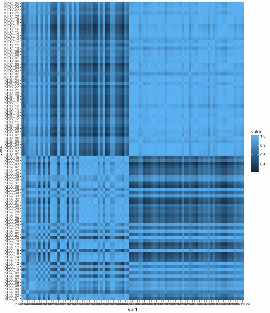
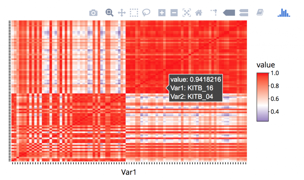
In the dataset we are using to learn there are 93 samples. What if we took and measured the correlation constant between all samples? This would create a 93 by 93 matrix of correlation values. A function to help us with this would be “cor” in R, and we can apply it to genes.
corr<-cor(genes)
We can type `corr` to display it within the console, and we see something like this (shown for only 6 samples):
 KITA_01 KITA_02 KITA_03 KITA_04 KITA_05 KITA_06
KITA_01 1.0000000 0.9172325 0.7059474 0.7890462 0.8727615 0.7956106
KITA_02 0.9172325 1.0000000 0.6796419 0.8972362 0.9245204 0.9117325
KITA_03 0.7059474 0.6796419 1.0000000 0.7943030 0.7975012 0.7706625
KITA_04 0.7890462 0.8972362 0.7943030 1.0000000 0.9774844 0.9919876
KITA_05 0.8727615 0.9245204 0.7975012 0.9774844 1.0000000 0.9828198
KITA_06 0.7956106 0.9117325 0.7706625 0.9919876 0.9828198 1.0000000
We note that the obviously when one variable is perfectly correlated to itself, just as we would expect.
Now we can’t see the matrix easily, and honestly they are difficult to compute. We could reshape this as a list of pairs and that would be easier. This is core to the concept of “melt”, which turns a square matrix, into minimal (in this case pairwise) components.
library reshape2
melted_corr <- melt(corr)
head(melted_corr)
The second command provides us the first few lines to get the idea of what is happening.
X1 X2 value
1 KITA_01 KITA_01 1.0000000
2 KITA_02 KITA_01 0.9172325
3 KITA_03 KITA_01 0.7059474
4 KITA_04 KITA_01 0.7890462
5 KITA_05 KITA_01 0.8727615
6 KITA_06 KITA_01 0.7956106
We can actually visualize this as a heatmap to better view:
gplot(data = melted_corr, aes(x=Var1, y=Var2, fill=value)) + geom_tile()
However, we can do quite a bit and its best to find examples on the web. One example I found was:
ggplot(melted_corr , aes(x = Var1, y = Var2)) +
 geom_raster(aes(fill = value)) +
 scale_fill_gradient2(low="navy", mid="white", high="red", midpoint=0.5) + theme_classic()
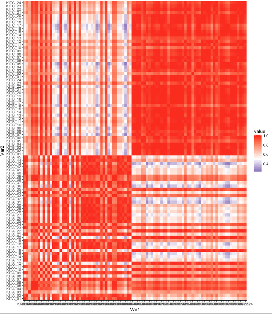
Now one thing we notice is that there are some samples that are like other samples. In fact we see the default organization of the samples shows some all like each other near top, and some that are different.
We are going to need to install a few libraries. See below:
install.packages('devtools')
devtools::install_github('hadley/ggplot2')
install.packages('reshape2')
Lets use a different library, “plotly” which adds additional functionality to ggplot. You may need to install the plotly packages via install.packages(‘plotly’) and some individuals may be requested to install development version of ggplot, you can do this via: install_github(“ggplot2”, “hadley”, “develop”). Here we remove some labels and make it work with hovering. The entire block is:
library(ggplot2)
library(reshape2)
corr<-cor(genes)
melted_corr <- melt(corr)
p<-ggplot(melted_corr , aes(x = Var1, y = Var2)) + geom_raster(aes(fill = value)) + scale_fill_gradient2(low="navy", mid="white", high="red", midpoint=0.5) + theme( plot.title = element_blank(),axis.text.x = element_blank(), axis.text.y = element_blank(), axis.title.y = element_blank(), axis.title.x = element_blank())
ggplotly(p)
Running a PCA
A PCA is a way projecting multi-variate data along fewer axis in a way that maximized the amount of variation around each access. Its unsupervised, meaning we aren’t comparing groups. Rather we are lookin for patterns.
```{r}
pcadf<-prcomp(genes, center = TRUE,scale. = TRUE)
pcadf<-data.frame(pcadf$rotation)
```
Lets graph the first two principle components.
``
ggplot(pcadf, aes(x=PC1, y=PC2)) + geom_point()
``
What patterns do see? Well I think we need to join some other data.
Joins and other functions
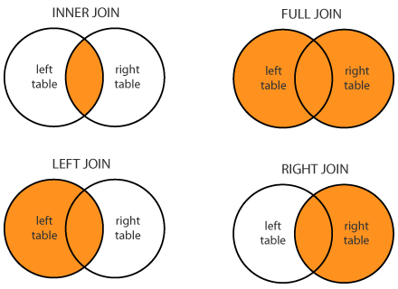
We refer to our DPLYR spreadsheet, but we note that these are data base functions common in tables. We want to join in our PCA Analysis and maybe color by something related to the sample. Here is some info on joining from the cheatsheet.
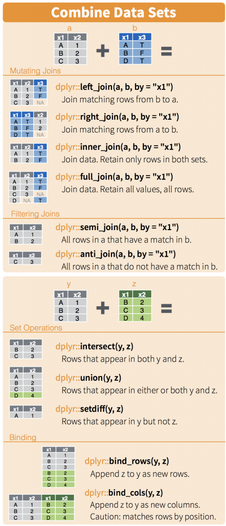
Now we are just introducing joins, and they are important with databases. There are three concepts to think about when merging tables. Sometimes they have the same rows and sometimes they don’t. In this case, its easy because they do. Still lets do an inner join.
We know the first thing we need to do is to have a common column to join on. When we look at the samples dataframe, you’ll notice there is no column, but that the rownames are what we want to join on. So lets make it easy and create a new column with these rownames
samples$uid<-rownames(samples)
pcadf$uid<-rownames(pcadf)
samples<-inner_join(samples,pcadf,by="uid")
```{r}
library(dplyr)
samples$uid<-rownames(samples)
pcadf$uid<-rownames(pcadf)
samples<-inner_join(samples,pcadf,by="uid")
```
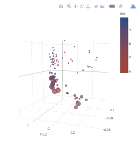
```{r}
plot_ly(samples, x = ~PC1, y = ~PC2, z = ~PC3, size=~reads,marker = list(symbol = 'circle', sizemode = 'diameter'), sizes = c(5, 25), color = ~Kit) %>%
add_markers() %>%
layout(scene = list(xaxis = list(title = 'PC1'),
yaxis = list(title = 'PC2'),
zaxis = list(title = 'PC3')))
```
samples$uid<-rownames(samples)
pcadf$uid<-rownames(pcadf)
samples<-inner_join(samples,pcadf,by="uid")
Now lets make our graph a little more informative. That’s five dimensions for those counting
plot_ly(samples, x = ~PC1, y = ~PC2, z = ~PC3, size=~reads,marker = list(symbol = 'circle', sizemode = 'diameter'), sizes = c(5, 25), color = ~RIN, colors = c('#BF382A', '#0C4B8E')) %>%
  add_markers() %>%
  layout(scene = list(xaxis = list(title = 'PC1'),
  yaxis = list(title = 'PC2'),
  zaxis = list(title = 'PC3')))
HYPOTHESIS TESTING

Most of the time we are examining two possibilities or two hypothesis, though in some cases we are comparing more than 1 case. A statistical test lets choose between two competing hypotheses. Similarly confidence intervals reflect the likely range of a population parameter. Scientific investigations start by expressing a hypothesis. Example: Mackowiak et al. hypothesized that the average normal (i.e., for healthy people) body temperature is less than the widely accepted value of 98.6°F. If we denote the population mean of normal body temperature as μ, then we can express this hypothesis as μ < 98.6. From this example:
- We refer to this hypothesis as the null hypothesis and denote it as H0.
- The null hypothesis usually reflects the “status quo” or “nothing of interest”.
In contrast, we refer to our hypothesis (i.e., the hypothesis we are investigating through a scientific study) as the alternative hypothesis and denote it as HA. In simple terms:
- HA : μ < 98.6
- H0 : μ = 98.6
Many of the statistical tests use a time-tested paradigm of statistical inference. In this paradigm, it usually:
- Has one or two data samples.
- Has two competing hypothesis.
- Each of which could be true.
- One hypothesis, called the null hypothesis, is that nothing happened:
- The mean was unchanged
- The treatment had no effect
- The model did not improve
- The other hypothesis, called the alternative hypothesis, is that something happened:
- The mean rose
- The treatment improved the patient’s health
- The model fit better
Lets say we want to compare something to the default or null expectation
- First, assume that the null hypothesis is true
- Then, calculate a test statistic. It could be something simple, such as the mean of the sample, or it could be quite complex.
- Know the statistic’s distribution.Know the distribution of the sample mean (i.e., invoking the Central Limit Theorem)
- Using the statistic and its distribution to calculate a p-value
- p-value is the probability of a test statistic value as extreme or more extreme than the one we observed, while assuming that the null hypothesis is true.
- If the p-value is too small, we have strong evidence against the null hypothesis. This is called rejecting the null hypothesis
- If the p-value is not small then we have no such evidence. This is called failing to reject the null hypothesis.
- Common convention regarding p-value interpretation:
- Reject the null hypothesis when p<0.05
- Fail to reject the null hypothesis when p>0.05
- In statistical terminology, the significance level of alpha=0.05 is used to define a border between strong evidence and insufficient evidence against the null hypothesis.
- Conventionally, a p-value of less than 0.05 indicates that the variables are likely not independent whereas a p-value exceeding 0.05 fails to provide any such evidence.
In other words: The null hypothesis is that the variables are independent. The alternative hypothesis is that the variables are not independent. For alpha = 0.05, if p<0.05 then we reject the null hypothesis, giving strong evidence that the variables are not independent; if p > 0.05, we fail to reject the null hypothesis. You are free to choose your own alpha, of course, in which case your decision to reject or fail to reject might be different.
When testing a hypothesis or a model, the p-value or probability value is the probability for a given statistical model that the default (or null) hypothesis is true, where the p-value of less than 0.05 indicating a 5% change the null hypothesis is wrong, and thus one accepts the alternative hypothesis.
Examples
UCLA Statistical Consulting.
Introduction
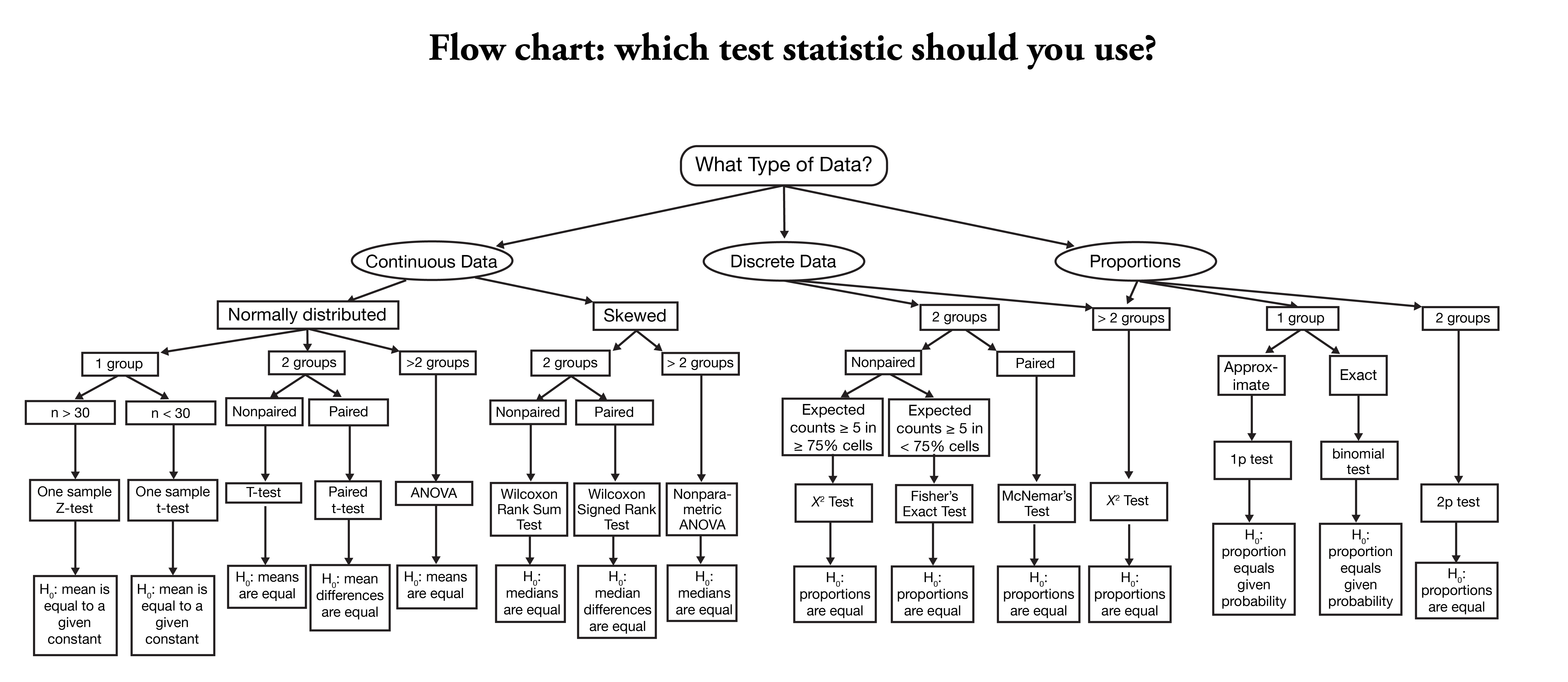
This page shows how to perform a number of statistical tests using R. Each section gives a brief description of the aim of the statistical test, when it is used, an example showing the R commands and R output with a brief interpretation of the output. You can see the page Choosing the Correct Statistical Test for a table that shows an overview of when each test is appropriate to use. In deciding which test is appropriate to use, it is important to consider the type of variables that you have (i.e., whether your variables are categorical, ordinal or interval and whether they are normally distributed), see What is the difference between categorical, ordinal and interval variables? for more information on this.
Setup
hsb2 <- within(read.csv("https://stats.idre.ucla.edu/stat/data/hsb2.csv"), {
    race <- as.factor(race)
    schtyp <- as.factor(schtyp)
    prog <- as.factor(prog)
})

attach(hsb2)
One sample t-test
t.test(write, mu = 50)
##
## 	One Sample t-test
##
## data:  write
## t = 4.14, df = 199, p-value = 5.121e-05
## alternative hypothesis: true mean is not equal to 50
## 95 percent confidence interval:
##  51.5 54.1
## sample estimates:
## mean of x
##      52.8
One sample median test
wilcox.test(write, mu = 50)
##
## 	Wilcoxon signed rank test with continuity correction
##
## data:  write
## V = 13177, p-value = 3.702e-05
## alternative hypothesis: true location is not equal to 50
Binomial test
prop.test(sum(female), length(female), p = 0.5)
##
## 	1-sample proportions test with continuity correction
##
## data:  sum(female) out of length(female), null probability 0.5
## X-squared = 1.45, df = 1, p-value = 0.2293
## alternative hypothesis: true p is not equal to 0.5
## 95 percent confidence interval:
##  0.473 0.615
## sample estimates:
##     p
## 0.545
Chi-square goodness of fit
chisq.test(table(race), p = c(10, 10, 10, 70)/100)
##
## 	Chi-squared test for given probabilities
##
## data:  table(race)
## X-squared = 5.03, df = 3, p-value = 0.1697
Two independent samples t-test
t.test(write ~ female)
##
## 	Welch Two Sample t-test
##
## data:  write by female
## t = -3.66, df = 170, p-value = 0.0003409
## alternative hypothesis: true difference in means is not equal to 0
## 95 percent confidence interval:
##  -7.50 -2.24
## sample estimates:
## mean in group 0 mean in group 1
##            50.1            55.0
Wilcoxon-Mann-Whitney test
wilcox.test(write ~ female)
##
## 	Wilcoxon rank sum test with continuity correction
##
## data:  write by female
## W = 3606, p-value = 0.0008749
## alternative hypothesis: true location shift is not equal to 0
Chi-square test
chisq.test(table(female, schtyp))
##
## 	Pearson's Chi-squared test with Yates' continuity correction
##
## data:  table(female, schtyp)
## X-squared = 5e-04, df = 1, p-value = 0.9815
Fisher’s exact test
fisher.test(table(race, schtyp))
##
## 	Fisher's Exact Test for Count Data
##
## data:  table(race, schtyp)
## p-value = 0.5975
## alternative hypothesis: two.sided
One-way ANOVA
summary(aov(write ~ prog))
##              Df Sum Sq Mean Sq F value  Pr(>F)
## prog          2   3176    1588    21.3 4.3e-09 ***
## Residuals   197  14703      75
## ---
## Signif. codes:  0 '***' 0.001 '**' 0.01 '*' 0.05 '.' 0.1 ' ' 1
Kruskal Wallis test
kruskal.test(write, prog)
##
## 	Kruskal-Wallis rank sum test
##
## data:  write and prog
## Kruskal-Wallis chi-squared = 34, df = 2, p-value = 4.047e-08
Paired t-test
t.test(write, read, paired = TRUE)
##
## 	Paired t-test
##
## data:  write and read
## t = 0.867, df = 199, p-value = 0.3868
## alternative hypothesis: true difference in means is not equal to 0
## 95 percent confidence interval:
##  -0.694  1.784
## sample estimates:
## mean of the differences
##                   0.545
Wilcoxon signed rank sum test
wilcox.test(write, read, paired = TRUE)
##
## 	Wilcoxon signed rank test with continuity correction
##
## data:  write and read
## V = 9261, p-value = 0.3666
## alternative hypothesis: true location shift is not equal to 0
McNemar test
X <- matrix(c(172, 7, 6, 15), 2, 2)
mcnemar.test(X)
##
## 	McNemar's Chi-squared test with continuity correction
##
## data:  X
## McNemar's chi-squared = 0, df = 1, p-value = 1
One-way repeated measures ANOVA
require(car)
require(foreign)
kirk <- within(read.dta("https://stats.idre.ucla.edu/stat/stata/examples/kirk/rb4.dta"),
    {
        s <- as.factor(s)
        a <- as.factor(a)
    })

model <- lm(y ~ a + s, data = kirk)
analysis <- Anova(model, idata = kirk, idesign = ~s)
print(analysis)
## Anova Table (Type II tests)
##
## Response: y
##           Sum Sq Df F value  Pr(>F)
## a           49.0  3    11.6 0.00011 ***
## s           31.5  7     3.2 0.01802 *
## Residuals   29.5 21
## ---
## Signif. codes:  0 '***' 0.001 '**' 0.01 '*' 0.05 '.' 0.1 ' ' 1
Repeated measures logistic regression
require(lme4)
exercise <- within(read.dta("https://stats.idre.ucla.edu/stat/stata/whatstat/exercise.dta"),
    {
        id <- as.factor(id)
        diet <- as.factor(diet)
    })
glmer(highpulse ~ diet + (1 | id), data = exercise, family = binomial)
## Generalized linear mixed model fit by the Laplace approximation
## Formula: highpulse ~ diet + (1 | id)
##    Data: exercise
##  AIC BIC logLik deviance
##  105 113  -49.7     99.5
## Random effects:
##  Groups Name        Variance Std.Dev.
##  id     (Intercept) 3.32     1.82
## Number of obs: 90, groups: id, 30
##
## Fixed effects:
##             Estimate Std. Error z value Pr(>|z|)
## (Intercept)   -2.004      0.663   -3.02   0.0025 **
## diet2          1.145      0.898    1.27   0.2022
## ---
## Signif. codes:  0 '***' 0.001 '**' 0.01 '*' 0.05 '.' 0.1 ' ' 1
##
## Correlation of Fixed Effects:
##       (Intr)
## diet2 -0.738
Factorial ANOVA
anova(lm(write ~ female * ses, data = hsb2))
## Analysis of Variance Table
##
## Response: write
##             Df Sum Sq Mean Sq F value  Pr(>F)
## female       1   1176    1176    14.7 0.00017 ***
## ses          1   1042    1042    13.1 0.00039 ***
## female:ses   1      0       0     0.0 0.98276
## Residuals  196  15660      80
## ---
## Signif. codes:  0 '***' 0.001 '**' 0.01 '*' 0.05 '.' 0.1 ' ' 1
Friedman test
friedman.test(cbind(read, write, math))
##
## 	Friedman rank sum test
##
## data:  cbind(read, write, math)
## Friedman chi-squared = 0.645, df = 2, p-value = 0.7244
Factorial logistic regression
summary(glm(female ~ prog * schtyp, data = hsb2, family = binomial))
##
## Call:
## glm(formula = female ~ prog * schtyp, family = binomial, data = hsb2)
##
## Deviance Residuals:
##    Min      1Q  Median      3Q     Max
##  -1.89   -1.25    1.06    1.11    1.20
##
## Coefficients:
##               Estimate Std. Error z value Pr(>|z|)
## (Intercept)    -0.0513     0.3204   -0.16     0.87
## prog2           0.3246     0.3911    0.83     0.41
## prog3           0.2183     0.4319    0.51     0.61
## schtyp2         1.6607     1.1413    1.46     0.15
## prog2:schtyp2  -1.9340     1.2327   -1.57     0.12
## prog3:schtyp2  -1.8278     1.8402   -0.99     0.32
##
## (Dispersion parameter for binomial family taken to be 1)
##
##     Null deviance: 275.64  on 199  degrees of freedom
## Residual deviance: 272.49  on 194  degrees of freedom
## AIC: 284.5
##
## Number of Fisher Scoring iterations: 3
Correlation
cor(read, write)
## [1] 0.597
cor.test(read, write)
##
## 	Pearson's product-moment correlation
##
## data:  read and write
## t = 10.5, df = 198, p-value < 2.2e-16
## alternative hypothesis: true correlation is not equal to 0
## 95 percent confidence interval:
##  0.499 0.679
## sample estimates:
##   cor
## 0.597
Simple linear regression
lm(write ~ read)
##
## Call:
## lm(formula = write ~ read)
##
## Coefficients:
## (Intercept)         read
##      23.959        0.552
Non-parametric correlation
cor.test(write, read, method = "spearman")
## Warning: Cannot compute exact p-values with ties
##
## 	Spearman's rank correlation rho
##
## data:  write and read
## S = 510993, p-value < 2.2e-16
## alternative hypothesis: true rho is not equal to 0
## sample estimates:
##   rho
## 0.617
Simple logistic regression
glm(female ~ read, family = binomial)
##
## Call:  glm(formula = female ~ read, family = binomial)
##
## Coefficients:
## (Intercept)         read
##      0.7261      -0.0104
##
## Degrees of Freedom: 199 Total (i.e. Null);  198 Residual
## Null Deviance:	    276
## Residual Deviance: 275 	AIC: 279
Multiple regression
lm(write ~ female + read + math + science + socst)
##
## Call:
## lm(formula = write ~ female + read + math + science + socst)
##
## Coefficients:
## (Intercept)       female         read         math      science
##       6.139        5.493        0.125        0.238        0.242
##       socst
##       0.229
Analysis of covariance
summary(aov(write ~ prog + read))
##              Df Sum Sq Mean Sq F value  Pr(>F)
## prog          2   3176    1588    28.6 1.2e-11 ***
## read          1   3842    3842    69.3 1.4e-14 ***
## Residuals   196  10861      55
## ---
## Signif. codes:  0 '***' 0.001 '**' 0.01 '*' 0.05 '.' 0.1 ' ' 1
Multiple logistic regression
glm(female ~ read + write, family = binomial)
##
## Call:  glm(formula = female ~ read + write, family = binomial)
##
## Coefficients:
## (Intercept)         read        write
##      -1.706       -0.071        0.106
##
## Degrees of Freedom: 199 Total (i.e. Null);  197 Residual
## Null Deviance:	    276
## Residual Deviance: 248 	AIC: 254
Ordered logistic regression
Ordered logistic regression is used when the dependent variable is ordered, but not continuous. For example, using the hsb2 data file we will create an ordered variable called write3. This variable will have the values 1, 2 and 3, indicating a low, medium or high writing score. We do not generally recommend categorizing a continuous variable in this way; we are simply creating a variable to use for this example. We will use gender (female), reading score (read) and social studies score (socst) as predictor variables in this model.
require(MASS)
## Creat order variable write3 as a factor with levels 1, 2, and 3
hsb2$write3 <- cut(hsb2$write, c(0, 48, 57, 70),  right = TRUE, labels = c(1,2,3))
table(hsb2$write3)
##
##  1  2  3
## 61 61 78
## fit ordered logit model and store results 'm'
m <- polr(write3 ~ female + read + socst, data = hsb2, Hess=TRUE)
## view a summary of the model
summary(m)
## Call:
## polr(formula = write3 ~ female + read + socst, data = hsb2, Hess = TRUE)
##
## Coefficients:
##         Value Std. Error t value
## female 1.2854     0.3244    3.96
## read   0.1177     0.0214    5.51
## socst  0.0802     0.0194    4.12
##
## Intercepts:
##     Value  Std. Error t value
## 1|2  9.704  1.197      8.108
## 2|3 11.800  1.304      9.049
##
## Residual Deviance: 312.55
## AIC: 322.55
Unsupervised Analysis
One concept is supervised vs unsupervised analysis methods. Supervised methods are when you identifying classes using algorithms and unsupervised is when we are identifying classes that are assigned. In the case of our data, the supervised classes are “Kit”. Unsupervised groups will be identified through algorithms. One such algorithm is Hierarchal clustering.
Dataset
We will use some libraries
{
  library(ggplot2)
  library('RColorBrewer')
  library(dplyr)
  library(plotly)

}
Lets load in and inspect the dataset.
{
setwd(dir = '~/trgn510/')
genotypes <- read.csv('kg.genotypes.csv',header = TRUE, sep = ",",
quote = "\"", dec = ".", fill = TRUE, row.names = 1)
population_details <- read.csv('kg.poplist.csv',header = TRUE, sep = ",",
quote = "\"", dec = ".", fill = TRUE)
PopList <- data.frame(population_details[,c(4,3,2)])
}  # Load in Data
Lets conduct a PCA
library(dplyr)
genotypes_mini <- genotypes[c(1:10000),]
pca_anal <- prcomp(genotypes_mini)
rotation <- data.frame(Sample=row.names(pca_anal$rotation), pca_anal$rotation[,1:6],row.names = NULL)
people_PCA_diversity<-inner_join(PopList,rotation, b, by = "Sample")
Lets make an initial plot
plot_ly(people_PCA_diversity, x = ~PC1, y = ~PC2, z = ~PC3,
color = ~Cohort,
yaxis = list(title = 'PC2'), zaxis = list(title = 'PC3')))